A website is a collection of logically related web pages. A well-built website is the key to the successful promotion of any business model. In order to create a good website, you need to follow simple and at the same time very important rules and principles. In this article, we will look through the elements a successful website should consist of.
Structure of the webpage
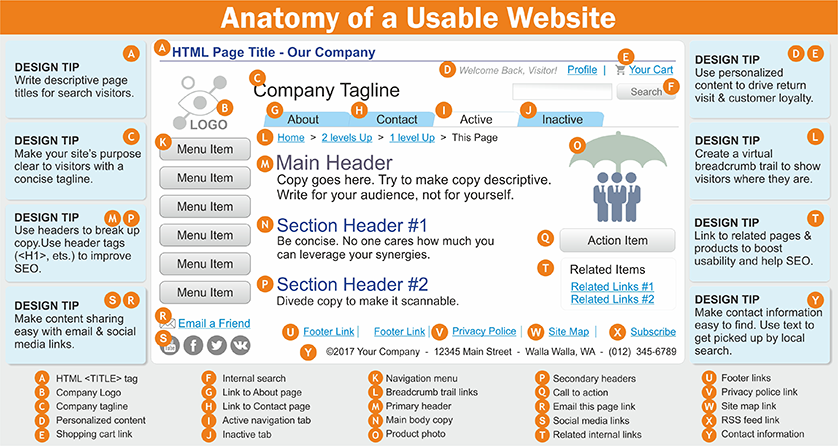
A. HTML <TITLE> tag
 The title is a very important element on the page. In terms of user navigation, it should describe the content displayed on the page so that the user knows what to expect from it and is sure that it is in the right place. The title should be related to SEO optimization – so that search engines understand the topic of the main page of the site, so it is best to include the main keyword in the title.
If it's a product page, for example, it's wise to just use the product name. With more social content, such as blog posts, you also need to consider how much the headline attracts clicks because, in this case, they usually rely not only on links from search engines but also from social networks such as Twitter.
B. Company Logo
 The company logo is the most important element of branding. A good logo:
- is сlear, balanced image without unnecessary elements that clutter the logo;
- has a distinctive bright design that will attract attention even with a fleeting glance;
- has a graphic image that looks in accordance with the implemented services;
- corresponds to the company name;
- contains inscriptions made in a readable font;
- looks good in color and in black and white;
- looks equally good on both the web page and the print version.
C. Company tagline
 Company tagline is a phrase of 3 to 7 words that corresponds to the logo of the company. Creating a good slogan requires as much attention and money as creating a logo. Together with the logo, the slogan should evoke in the minds of potential customers thoughts about a particular company and its services.
D. Personalized content
![]() Competent personalized content:
Competent personalized content:
- provides each user with content related to their previous actions on the site;
- selects and edits proposals based on demographic, age and other data;
- analyzes the visitor behavior in real time and responds to calls to action (CTA);
- shows the corresponding message to the desired user at the appropriate time.
E. Shopping cart link
 The cart link should be clearly visible and by default in the upper right corner of the page. A plus will be a mini-version of the trash in the pop-up window after hovering over the link.
F. Internal search
![]() In many cases, companies focus on their ranking of Google search results but tend to ignore the importance of internal search capabilities on their own websites. The ability to search internally on a company's website improves the overall user interface and optimizes the organization of the site.
In many cases, companies focus on their ranking of Google search results but tend to ignore the importance of internal search capabilities on their own websites. The ability to search internally on a company's website improves the overall user interface and optimizes the organization of the site.
The main functions of internal search:
- Navigational function. An internal search of the site allows the visitor to go to a specific page that they need immediately. This directs the potential customer to where he wants to be on your site, as he is looking for a specific service, product, contact information or support information. Potential customers are also more likely to use internal site search to find solutions to their business problems.
- Informational functional. By analyzing how and what visitors search using the internal search tool, you can identify what new content to suggest, update keyword strategies for regular search, or even change the structure of your site to show the most frequently viewed topics first. In addition, if existing customers are looking for certain information that is not yet available, you can create new site pages, blogs, e-books and case studies focused on them. Using search analytics will also help identify problems with site navigation or site structure. By fixing these issues, customers can access the content they need most, including key transaction pages such as forms and contact pages.
G. Link to About page
 The importance of the About Us page is often underestimated, although some experts claim that a memorable About Us page creates a unique identity for a web resource.
H. Link to Contact page
 Contact information should include signals of trust, such as a landline, legal and physical address of the organization.
I. Active navigation tab & J. Inactive tab
 Only one tab of the navigation bar should be selected at a time – the one that is currently open. This can be achieved, for example, by highlighting, changing the font size using CSS.
K. Navigation menu
 The navigation bar is a part of the information architecture that is available for organizing and marking the content of the website to ensure ease of use and search. The navigation bar helps users find what they are looking for, as well as directs them to the areas in which the portal owner wants to send them. Navigation is fundamental to information architecture and should be defined at the research and planning stage. In essence, navigation should make it as easy as possible for users to complete their immediate tasks.
L. Breadcrumb trail links
![]() Breadcrumbs are an important factor in the ease of use of websites, as they show the users what page they are on. Often, traveling through the site goes quite far in the nested categories, and it also allows users to quickly return to higher-level categories – no matter which page of the site they opened first. Breadcrumbs are also useful for SEO because they allow search engines to more easily define the structure of the site.
Breadcrumbs are an important factor in the ease of use of websites, as they show the users what page they are on. Often, traveling through the site goes quite far in the nested categories, and it also allows users to quickly return to higher-level categories – no matter which page of the site they opened first. Breadcrumbs are also useful for SEO because they allow search engines to more easily define the structure of the site.
Using microdata markup allows you to display data as «bread crumbs» in search results instead of ugly URLs – just display the domain name of the link to «bread crumbs». This is another good confidence signal that can help increase CTR.
M. Primary header
 Search engines read pages from top to bottom. The
N. Main body copy
Writing text for a Web-resource is performed simultaneously for both users and search engines. The copy should be unique, using keywords and synonyms in the places that best fit the content.The copy should be clear and detailed, focusing more on the benefits of the product than on its features, designed for the potential user. For a copy to be memorable, it must be written with cognitive ease – to avoid the use of jargon and follow those phrases that people can easily understand (and can actually search).Using familiar language reduces cognitive stress, making the copy more believable and convincing.
O. Product photo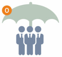 Images are much more memorable than text, and many online shoppers will browse products (posts, articles) by looking only at images. For the offered products, it is necessary to use clear images and to allocate the maximum possible space for images. You should also consider including a larger version or zoom feature.
The default image should be the most appropriate (for example, the best-selling color option), and additional images should be available to cover different color options.
P. Secondary headers
 The top of the page must contain one and only one <H1< tag, which includes keywords. The rest of the content should be broken down by appropriate header tags, following the hierarchy (<H2>, <H3>, <H4>), and include keywords.
Q. Call to action
 Call to action Call to action (CTA) – call the user to certain actions on the web portal. There are different types of CTA.
Awareness CTA – this type of call to action is associated with a proposal on the main page of content, through which the visitor can get more information on a particular topic.
Consideration CTA – such calls to action are related to content that helps solve problems or tasks that the user has entered the web portal.
Decision CTA – such a call to action is associated with an offer to try a product, such as a demo version or a free trial.
The most important CTA should be displayed at the top of the site, without having to scroll down the page.
On average, a CTA button raises a conversion 2.75 times, and a large color button can increase it 5 times.
R. Email this page link
![]() It opens the default email client to send a link to this page by email.
It opens the default email client to send a link to this page by email.
S. Social media links
 In order for people to buy the offered product or service, they must first trust its provider (web resource). In addition to great design, content and UX, you can increase user confidence by including trust signals, such as chat with a company representative, detailed contacts of the organization, customer feedback, social media pages and more. Most trust signals are aimed at convincing the user that the website is run by real people, it is quite large in its business and it is trusted by other users.
T. Related internal links
 The success of a site depends on internal links for the following three reasons:
- Internal links transfer link authority from one page to another (search engine optimization).
- They direct the user to pages with high value and conversion (usability).
- They perform the role of CTA (conversion optimization).
U. Footer links
 As part of the site template, users expect to find some information in the footer, such as links to company pages («About Us», «Contact Us»), links to other pages (blog), links to T&C and social media pages.
It is believed that users who have viewed the entire page are already interested, so you need to optimize the footer with additional CTAs, such as the newsletter subscription form.
You can also reward the interest of users and make the footer more interesting with a unique or humorous design.
V. Privacy policy link
![]() This element opens a page with an agreement, which should indicate whether the site collects personal data, what exactly the data is and why. The list of data that is considered personal may differ depending on the laws of different countries. Alternate titles for this page:
This element opens a page with an agreement, which should indicate whether the site collects personal data, what exactly the data is and why. The list of data that is considered personal may differ depending on the laws of different countries. Alternate titles for this page:
- Privacy Statement
- Privacy Notice
- Privacy Information
- Privacy Page
Ideally, the users are given the choice of whether they agree to the gathering of their data and whether they are given access to the settings of which cookies they agree to use.
W. Site map link
 Links to a site map page that:
- serves to facilitate access to important parts of the site and important content;
- helps the visitor to explore the website.
The version of the site map that is shown to the user is different from the XML map used by search engines.
X. RSS feed link
![]() It contains a link to a subscription to the RSS feed (Rich Site Summary), which is a web format for publishing content. RSS allows you to report news and updates to all people who have subscribed to the web feed.
It contains a link to a subscription to the RSS feed (Rich Site Summary), which is a web format for publishing content. RSS allows you to report news and updates to all people who have subscribed to the web feed.
Y. Contact information
![]() The element contains the most important contacts for quick communication of the client with the organization (more details in point H).
The element contains the most important contacts for quick communication of the client with the organization (more details in point H).

