Today, almost every site has a form with fields for the user to enter certain information. These can be forms of authorization, registration, password change, a form for comments and feedback, a feedback form itself, payment information, questionnaires, and many others. They must meet certain requirements in terms of appearance and usability, as well as functionality. The speed of solving the user’s problem and the general impression of the service depends on this. A form is considered good if, while filling it out, users don’t have any questions.
What is important when testing forms?
1. Is it clear what the form is for and why you need to fill it out?
First of all, you need to make sure that the layout of the form is easy to understand, as a complex form or a form with many fields will make users unwilling to fill it out. A form will get a higher conversion rate if it has fewer fields and is well designed and easy to fill out.
Each form should ask the user only the necessary minimum of information, the user should always understand what specific data is expected and why. Therefore, in complex forms, all ambiguous fields must have appropriate comments. Also, all fields can have a text placeholder, which contains a hint about what to specify in the field and disappears when the first character is entered. If the text boxes contain placeholders, they should be centered vertically. If the form contains fields for specifying personal information, such as phone numbers and addresses, an explanation of how this information will be used needs to be added.
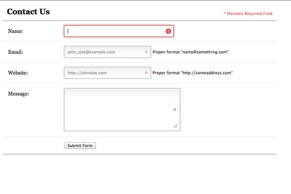
2. Are the required fields marked? Are all the required fields marked?
First, you need to check whether all the required fields in the forms are marked with an asterisk.It should also be noted that fields marked with an asterisk are required. This makes it easier for users to understand which fields they need to fill in and which are optional. If all fields are required, there should be no asterisks in front of the name.
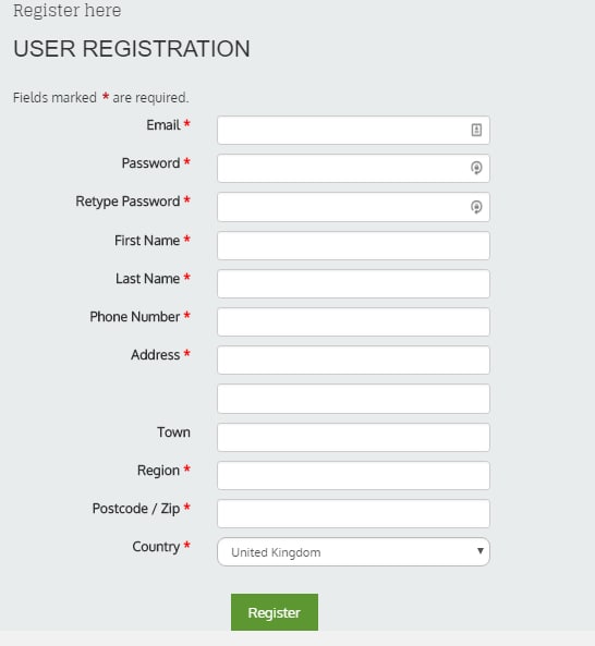
If the user entered some data incorrectly or went to another page, and then returned to filling out the form again, the form should be shown again and all the entered data (except for passwords and CAPTCHA fields) should retain their values.
3. Is there a built-in check for filling in required and optional fields?
There are 2 types of validation:
inline validation and form submission validation.
Inline validation is an automatic, real-time validation of entered data. If the user fills in the information correctly, a green checkmark may appear next to the input line. If something is wrong, an error message appears. This verification method significantly improves conversion and saves the user time.

Validation when submitting a form is carried out only after the form is submitted, that is, if there are any problems with one or more form fields, the user will receive feedback only after submitting the form.
4. Is the correctness of the entered contact information being checked?
Forms must validate the entry of values in some fields, such as an email address or phone number. If an error is detected, the cursor should be automatically moved to the field with an error and the reason for the unsuccessful sending of data should be indicated in a convenient place for perception. All incorrectly filled fields should be visually highlighted and next to the field the essence of the filling error is indicated, as well as a hint for correct filling.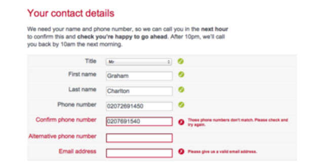
5. How are drop-down lists arranged?
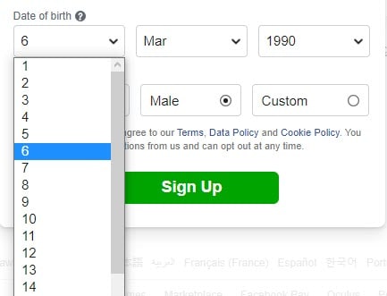
A drop-down list is a graphical user interface element that allows users to select one of several parameter values. Like any form element, the list must have a title and a placeholder. You should also check if there is a default option: the default option should only be if you are confident that about 90% of users will choose it. Otherwise, you must provide this field blank. As a rule, drop-down lists are used when the number of parameter values is from 5 to 15. If the options are less than 5, then you need to use radio buttons, if there are more than 15 options, then either reduce their number or replace the drop-down list with a text field.
6. What is happening while submitting a form?
Hovering over the submit data button and clicking on it should be accompanied by a simple animation of this button (for example, enlargement, indentations, changes in color, size, shadow, etc.)
After successfully submitting the form, you should ensure that the user receives an appropriate message.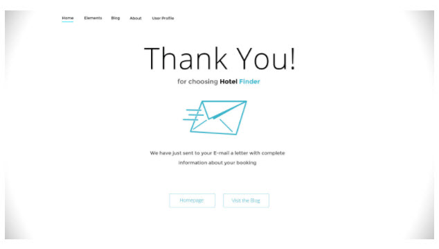
7. Is personal data available without authorization in the system?
You need to make sure that some functionality is not available to an unauthorized user.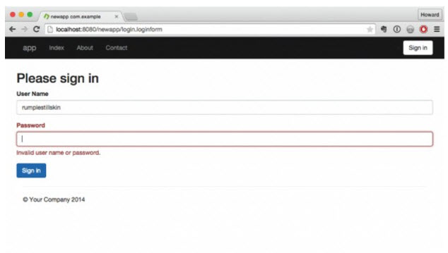
8. Does the functionality in forms work correctly when entering data?
First of all, you should check all the positive cases that are most often encountered by users of the resource. A positive test case uses only correct data and verifies that the application executed the function correctly, is called, that is, it must show that the program works as expected, provided that the user enters the correct data and does not go beyond the intended behavior scenario.
These cases include filling in all the required form fields with correct, valid data, which should not cause any failures/errors on the server side. This is the simplest testing phase.
As for negative testing, there can be a lot of different tests and checks. Let’s consider the main ones.
If we are talking about numeric fields, then these fields can be checked by entering:
- numbers with letters;
- numbers with a dot;
- numbers with a comma;
- numbers with special characters;
- numbers of different lengths (both whole and fractional parts);
- empty fields;
- spaces, etc.
For text fields, a different set of tests can be defined, specific to certain conditions. For example, a field for entering an email address:
- the address lacks the required symbols «@» and «.»;
- a sequence of characters «@» and «.»;
- the number of characters «@» and «.»;
- only numbers in the email address;
- special characters in the email address;
- allowed address length;
- empty field;
- spaces, etc.
If not all required fields are filled in, then the empty fields should be highlighted and, preferably, accompanied by error messages.
If there are two fields: one for entering a password, and the second for confirming it, then when entering different passwords, the corresponding messages should appear and these fields should be highlighted.
Also, when testing text fields, you should pay attention to the possibility of XSS and SQL injection. The content of text fields should be checked for special characters and tags.
It is considered good practice if text fields are automatically filled in with pre-known data. For example, for an authorized user, fields with name, surname, phone number, home address, the email address can be automatically filled in (if such data is available in the user’s personal account).


