Blog post and blog page anatomy
- 27.03.2018
- Posted by: Admin
Nowadays there are more and more places where people can express their point of view and share their experience with others. Such resources include various social networks, forums, blogs. As a result, it is increasingly necessary to test them, so it is necessary to know their structure and the names of the elements of which they consist.
1. Anatomy of a blog post
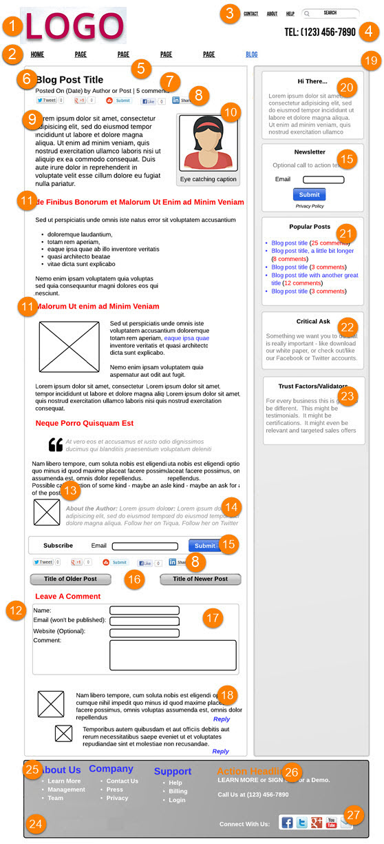
A blog post is a page where there is only one post with the most detailed information about it. It also includes comments and responses to them and many other interactive elements of the page. The following is an example of a blog post page with a detailed description of all items.
2. Anatomy of a blog page
The blog page contains a list of posts with pagination and other elements for finding and navigating to posts of interest to the user. Pagination is the ordinal numbering of pages, which is usually at the top or bottom of the pages of the site. From the blog page, the user can go to the blog post page. The following is an example blog page.
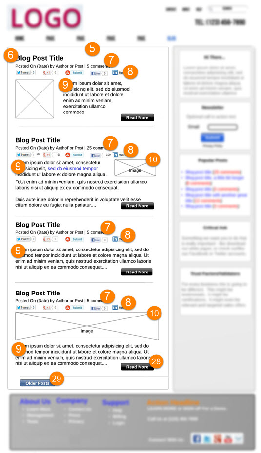
The classic version of a blog page consists of the following elements:
1) Logo
 The logo must be present on the site. It must have good quality.
2) Main Navigation
![]() It is one of the main functional elements of the site, which consists of a set of links to different pages. Each of the links is called a menu item. The visitor of the site uses the menu as a means of navigation.
It is one of the main functional elements of the site, which consists of a set of links to different pages. Each of the links is called a menu item. The visitor of the site uses the menu as a means of navigation.
3) Secondary Navigation
![]() Additional site menu as a rule has a more complex hierarchical structure and there are 3 types:
Additional site menu as a rule has a more complex hierarchical structure and there are 3 types:
- drop-down menu which opens after hovering the cursor over the menu item;
- drop-down menu which opens the structure after clicking on the menu button;
- open menu which usually has a tree-like, static structure.
4) Main Contact Area
![]() The phone number is placed most often in this area, because specifying a phone number is the most efficient use of this space.
The phone number is placed most often in this area, because specifying a phone number is the most efficient use of this space.
5) Blog Post Area
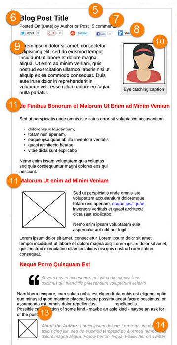
This is the main place where all the information of the current post is located. The site owner has many options and opportunities to impress visitors by making effective use of this space.
6) Blog Post Title
 When a new visitor opens this page, they will first read the title of the site and then the title of the post to see if they want to stay and read the post. Therefore, the title should interest the user.
7) Meta Information
![]() Metadata is designed to convince the reader that this message is for him even more. Such metadata may include: post creation date, number of views, number of likes / dislikes / reposts, number of comments, author and more.
Metadata is designed to convince the reader that this message is for him even more. Such metadata may include: post creation date, number of views, number of likes / dislikes / reposts, number of comments, author and more.
8) Social Share Bar
![]() It contains several buttons for sharing a post on social networks.
It contains several buttons for sharing a post on social networks.
9) Beginning of Post
 It is very important to grasp the interest of the user in order to reassure him that he is in the right place.
10) Image
 Among the most noticeable elements of the post is the image. Images can be placed on the left or right, at the request of the author.
11) Headlines
![]() Headlines are another way to draw attention to the material. Font sizes, font colors, and indents should be considered.
Headlines are another way to draw attention to the material. Font sizes, font colors, and indents should be considered.
12) Bottom of Post
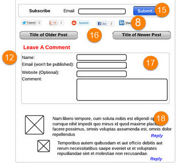 This is the interactive part of any blog that is designed for the interaction of users with your post. Here they can share the post, leave the comments on the post, buy something or subscribe to the blog.
13) Call to Action
 This block is optional, however it is sometimes very useful to ask a question to try to start an additional dialogue. It can make wonders after you simply ask questions like «What do you think about it?» or leave the «Share your experience» message.
14) Author Bio
 This block consists a more detailed information about the author.
15) Subscribe Bar
 In this block one can subscribe for the newsletter and news from the author
16) Most Recent Posts
 It provides the readers with the access to a range of older posts and news and those that are new.
17) Comment Form
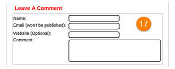 The form that allows readers to leave the comments on the post and discuss it.
18) Threaded Comments
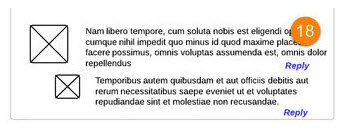 The user has to be able not only to write some new comments but also to answer to already written commentaries.
19) Sidebar
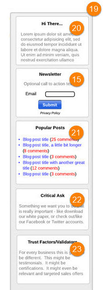 It includes several items that must be displayed, such as location, popular posts, and more. Due to the reason that the sidebar is permanent, its placement on the right is most readable.
20) Hi There!
 It shows the list of users that are currently reading the post or the list of users that have subscribed and followed the post.
21) Popular Posts
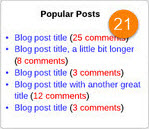 This block is very useful. It allows to hold viewer's attention to the site longer as it displays the list of other popular posts.
22) Critical Ask
 This block is very important. Having been formulated correctly, it can be quite useful. Users can additionally rate the post and add a comment about it.
23) Trust Factors
 In order to further strengthen the «expert» positioning, you can show in this block, for example, certificates or recommendations.
24) Footer
 The footer of the site is usually present on all sites. Here are some additional links to go to the site pages, contact information and other information.
25) Footer Headlines
![]() It has about the same content load as the headlines in the topic of the post.
It has about the same content load as the headlines in the topic of the post.
26) Request for Action/Contact Info
![]() This block may also be present in some cases if the site owner wants to present something special, such as an exclusive offer.
This block may also be present in some cases if the site owner wants to present something special, such as an exclusive offer.
27) Social Follow
 It displays the links to various social networking channels. Unlike the sharing block (point 8), which allows you to share a post on social networks, social support buttons allow you to view the pages of the resource on social networks.
28) Read More
 This button allows you to hide part of the text, making the page of the post more compact.
29) Older/Next Posts
![]() This is a link to older posts. It can also be new posts if you are not on the first page of the blog.
This is a link to older posts. It can also be new posts if you are not on the first page of the blog.
The knowledge of the structure of the blog page / blog post allows the tester to navigate it better, find more errors, make suggestions to the customer about how to improve its functionality, appearance and usability.


