Anatomy of an e-commerce page
- 16.04.2018
- Posted by: Admin

E-Commerce – is an area of the economy that includes all financial and trade transactions carried out through the computer networks and business processes related to such transactions. E-Commerce sites are designed to sell a variety of products over the Internet. These websites have a number of features that are determined by their purpose. The main ones are:
- full-fledged personal account (personal data, order history, status of current orders, the ability to make deferred purchases, payment information and delivery information, loyalty programs);
- connection to payment systems;
- integration with delivery services;
- the ability to manage discounts and markups on goods, to form different types of prices for different types of buyers, to set discounts on reaching a certain amount of goods, to create discount coupons;
- integration with warehouse accounting systems.
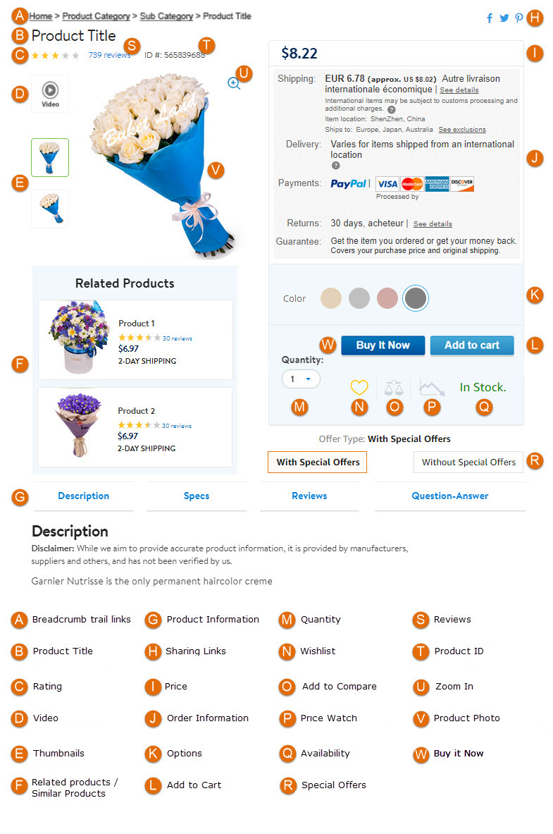
A. Breadcrumb trail links
B. Product Title
- does not contain abbreviations, except clear to all (kg, m, cm);
- does not contain professional terms that can be replaced by commonly used words;
- corresponds to the only standard formula adopted in a particular online store, for example, product type - smartphone, brand - Xiaomi, model - Redmi 4A, model article - 3614288;
- contains important characteristics that will help the visitor to make a choice, for example, for a smartphone it can be the amount of memory and color;
- helps to navigate the range easily and find the correct product among the entire list.
C. Rating
D. Video
 The product page often, in addition to images, also has demonstration videos that facilitate perception, allow you to see the product in action. It can also be 3D videos that allow you to view the product from any angle.
E. Thumbnails
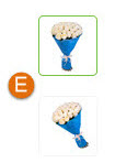 A thumbnail is a small copy of an image for compact presentation to the user. Thumbnails are often embedded in slides. Once the thumbnail is clicked, the corresponding image opens in its original size. Thumbnails save space while maintaining information.
F. Related Products/Similar Products
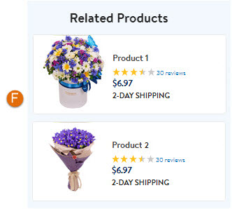 Choosing a phone, the buyer can look at the accessories that come with it (protective glass, case, memory card, etc.). The ability to buy the product in the kit increases the average check and the profit of the online store. The buyer can also get acquainted with goods similar to the interested ones.
G. Product Information
 The product description can consist of several tabs. These can be tabs with specifications, accessories, delivery and payment methods, questions, reviews, and other product information.
H. Sharing Links
I. Price
 Not one price, but several can be specified here. For example, an old (crossed out) price or a discounted/promotional price may also be provided.
J. Order Information
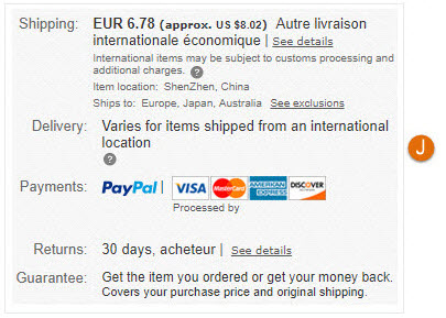 The user must know everything about the terms of payment, delivery of current goods. This block provides all the necessary information.
K. Options
 These can be radio buttons, checkboxes, or icons that allow you to select the characteristics of a product to buy it. For example, buying a smartphone, you can choose its color and amount of memory.
L. The «Add to Cart» button
M. Quantity
 With such a counter you can specify the number of items to buy. The limit values of the meter must be limited by the available quantity of goods in the warehouse and the value must not be negative or equal to 0.
N. Wishlist
O. Add to compare/Compare
P. Price watch
Q. Availability
 This icon will notify you if the item is in stock or out of stock.
R. Special offers
 This block can display additional products with a discount or accessories for the current product with favorable terms of purchase.
S. Reviews
T. Product ID
U. Zoom In
 It is very convenient when you need to view the details of the product. The enlarged image is usually displayed in a separate pop-up window.
V. Product photo
 Images are much better remembered than text and many shoppers on the Internet will view products (posts, articles), looking only at the image. For the offered products it is necessary to use clear images and to allocate the maximum possible space for images. You should also consider including a larger version of the image or zooming out.
The default image should be the most appropriate (for example, the color option that sells best) and additional images should be available to cover different color options and so on.
W. The «Buy it Now» button
 The functionality of the «Buy Now» button is similar to the functionality of the «Buy» button, but the user immediately after clicking goes to the stage of buying goods, while after clicking the «Buy» button, the user can continue to search and add other products to the cart.
Tags
bug
bug-report
game testing
glossary
homework assessment
Lecture #1 of software testing courses
Lecture #2 of software testing courses
Lecture #3 of software testing courses
Lecture #4 of software testing courses
Lecture #5 of software testing courses
Lecture #6. Software Testing: Basics and Practice
Lecture #7. Software Testing: Basics and Practice
lecture materials
mobile testing
QA terms
qa tips for beginner
self-training
test case
test design
training organizational questions

